Polaroid Productions
- Milly-Jane Peckham-Cooper 6265 Grace Redman 6274 Bethan Williamson 6357
Friday, 28 February 2014
Wednesday, 26 February 2014
First Draft
This is our first draft, our final draft is going to be adapted quite a lot however this shows our stages of development and we thought you may want to take a look.
New idea
After gaining positive and negative feedback we have chosen to improve our overall piece by putting our feedback into play. We have drawn up a storyboard of our new opening and are re-filming this weekend.We are using more close up's to increase tention and increasing the pace of the running to make it more believable.We have got into contact with a local musician and are recording a classical piece tailored to the moments of fear and suspense in our opening.
Thursday, 13 February 2014
Editing Timetable
Here is our editing timetable! We were proud that we stuck to this and due to this managed to edit our final piece with in our deadline, even with our glitches along the way meaning re filming was needed.
We took individual time to edit and as a group for final desisions.
Questionnaire feedback
We were given feedback on our questionnaire, which we then evaluated by re watching our film opening and creating a Prezi and commentary to show this feedback. Enjoy.
Monday, 10 February 2014
Photos from filming and Evaluation
We looked through our initial shots (some featured below) and evaluated areas which needed to be improved. The following issues we felt needed to be improved:
>higher key lighting to make image clearer
>change of costume due to bare skin at night looking unrealistic
>shots with the main character gaining more focus
Sunday, 9 February 2014
Logo sequence
This is our 'Logo sequence' to go at the beginning of our film opening. It is the first thing the audience see and allows them to understand who the production company is behind the movie.
Here is an example of Universals one:
Interestingly Warner Brothers change their sequence slightly for each film they produce. The logo is the same, but the colours, background and music changes slightly. Here is and example of some:
Here is Paramount's one:
Here is Polaroid Productions:(ours is a little shorter but just as effective)
Thursday, 6 February 2014
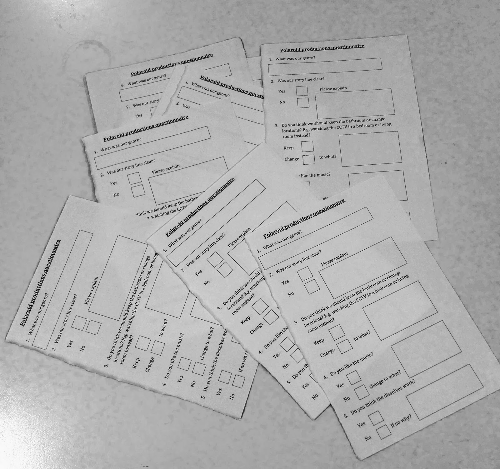
First Draft feedback questionnaire
We had a first draft showing of our film opening and in order to get feedback we created a questionnaire.

Wednesday, 5 February 2014
Research development
My post before on Japanese horror helped us see the over stylised approach is not one in which we want to go down. Our aim is to create a film which is applicable to everyday life, believable and therefore scary.
I did research into films that did this, including Human Centipede 1 and 2. The scare factor comes from the fact that it is humanely possible for these crimes to take place and the crime is carried out by a member of society.

By researching into crime rates and everyday crime we can now get a gist on what areas we should focus on, this will be done in my following post

By researching into crime rates and everyday crime we can now get a gist on what areas we should focus on, this will be done in my following post
Saturday, 1 February 2014
General update
We have been editing our first draft for our first draft showings and along the way have realised parts that will need to be refilmed and slight changes to our story line will be put in place. This along with the feedback we will gain from our first viewing via our questionnaires will help us to create the best piece we can!
Subscribe to:
Comments (Atom)


